Ripple
Brand world for a low-ABV sparkling spritzer—label system, flavor architecture, and a launch site that feels like summer without looking like soda.
The Challenge
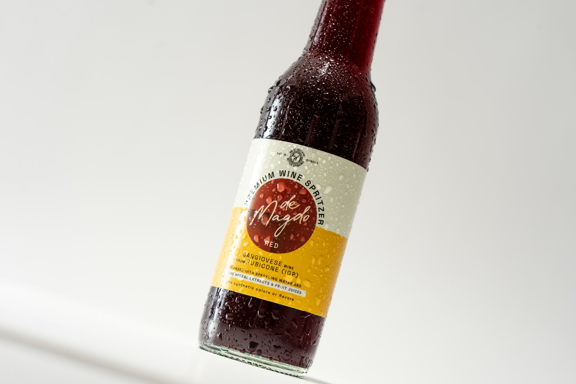
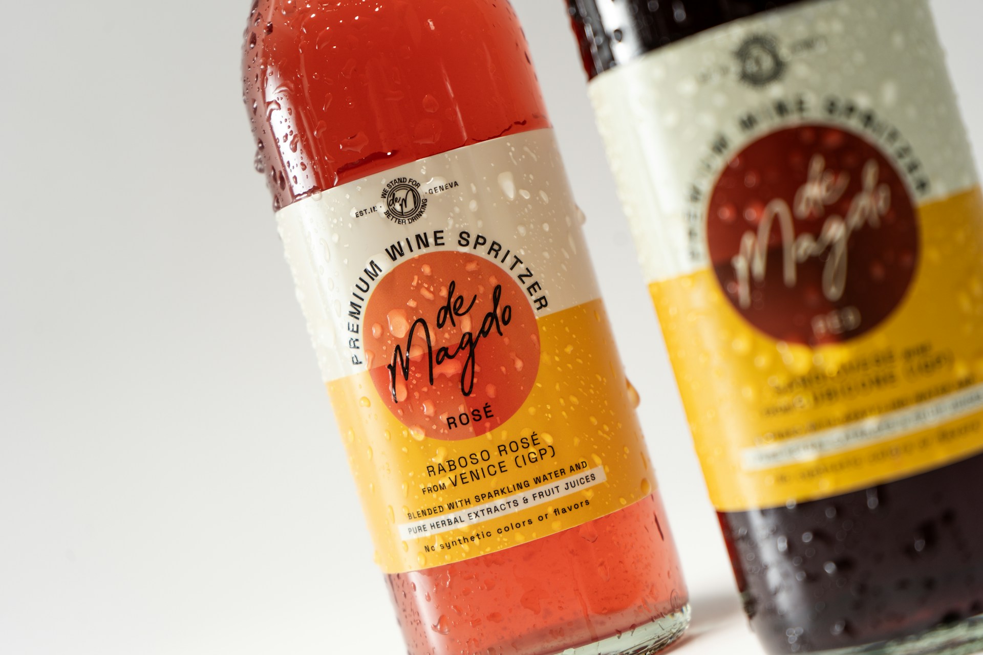
The team had a great liquid and a name sketch, but every can comp looked like either hard seltzer chaos or spa water. They needed a **Ripple** world that’s celebratory and light, with clear flavor cues at shelf—and a site that could grow when new SKUs drop.
What I Did
I defined a bubbly-but-minimal art direction: soft gradients, one bold wordmark, and a color chord per flavor that stays related across the line. I designed the can architecture (logo band, flavor callout, ABV line) and translated it into a simple marketing site with flavor pages that share one layout system. Co-packers got a spec sheet so print stayed consistent batch to batch.
Deliverables