Cove
Packaging and Shopify visuals for a small-batch organic coconut oil brand—earthy, trustworthy, and shelf-ready without looking like every other jar on the aisle.
The Challenge
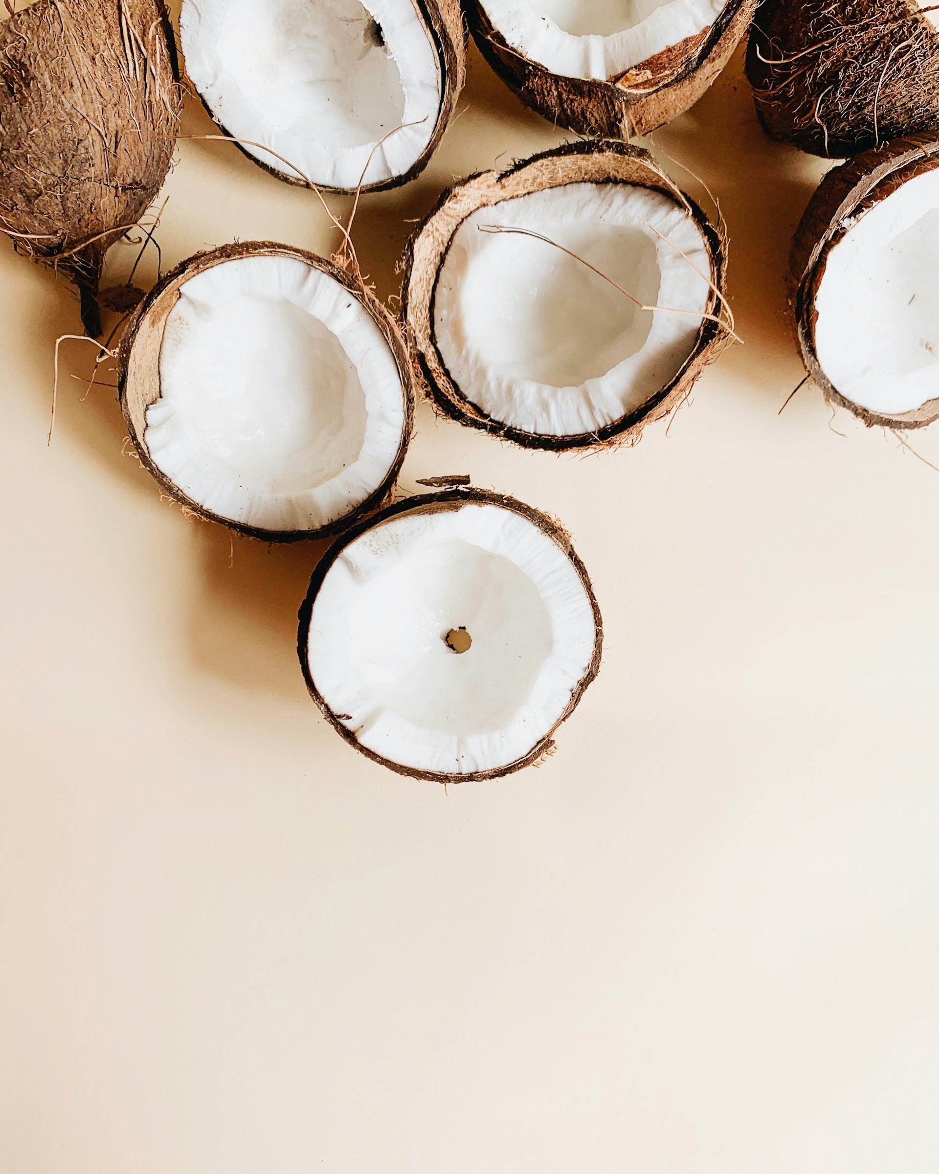
**Cove** had great oil and a farm-adjacent story, but their DIY label looked homemade in the wrong way—buyers couldn’t tell premium cold-pressed from bulk refills. They needed packaging that reads “specialty grocery” and a Shopify that doesn’t feel like a template, without a Fortune 500 budget.
What I Did
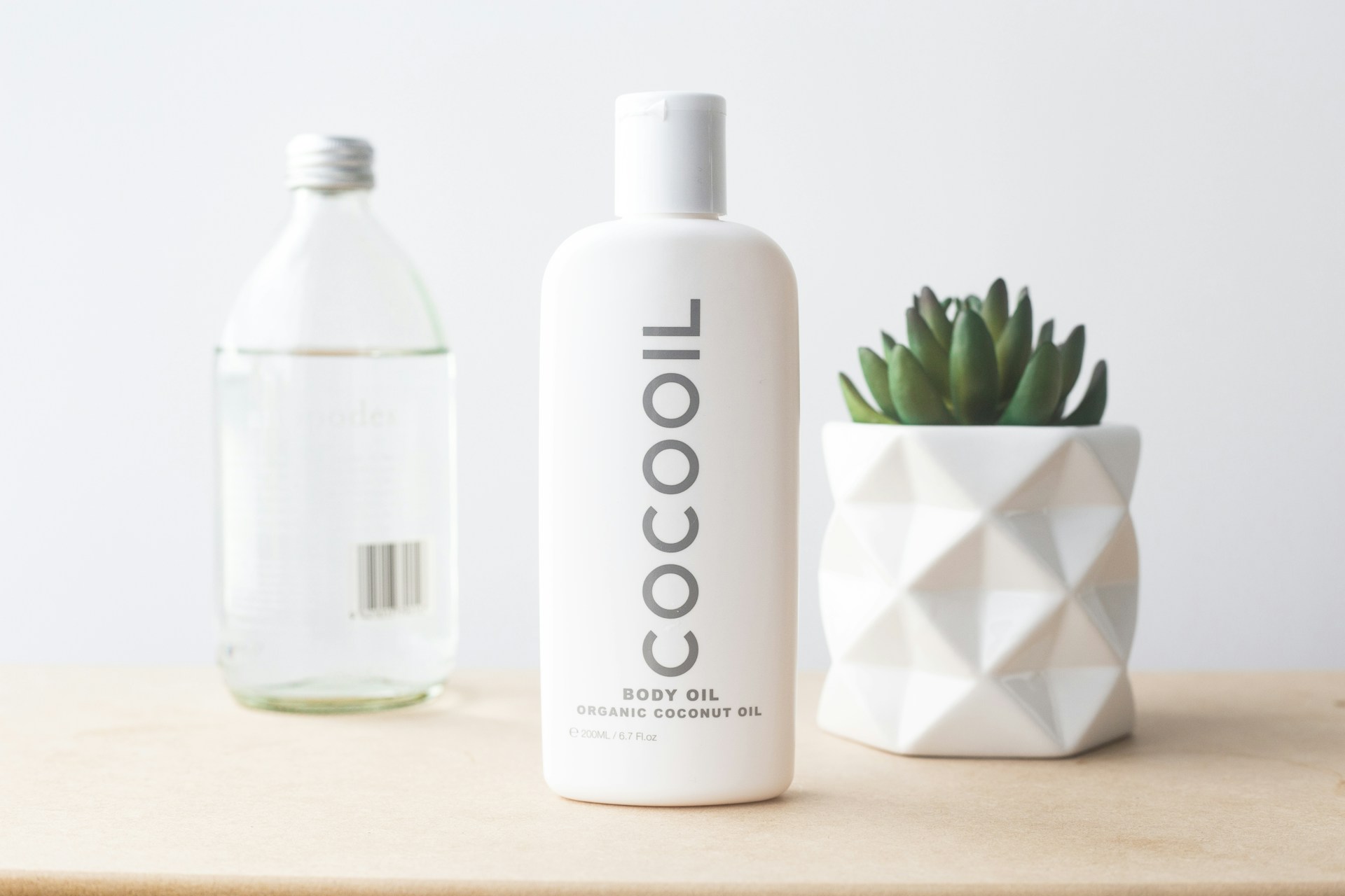
I built a small but flexible identity: a wordmark that feels organic without being crunchy, a restrained green palette, and label hierarchy that puts origin and use-case first. I designed the Shopify homepage and product templates around real photography direction (pour, spoon, morning light) so every asset feels like one brand. Wholesale buyers get a one-pager that matches the jar—no more mismatched PDFs.
Deliverables